Bringing Fluent Design to a Tauri App on Windows 11
How we adapted AlvaBars for Windows 11 Fluent styling without forking the codebase.
AlvaBars started life as a Mac-first Tauri + SvelteKit desktop app. This post walks through how we adapted its UI so it feels at home on Windows 11 — without forking the codebase or abandoning the original look.
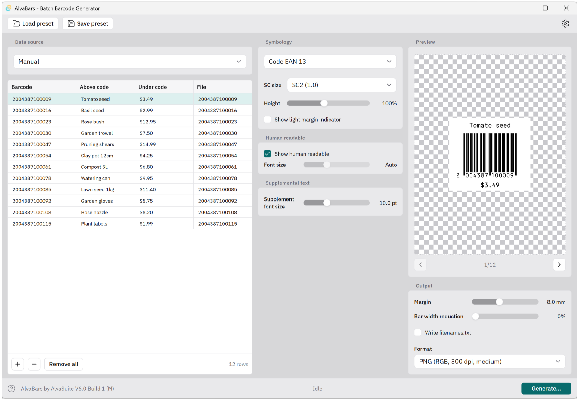
Before: the cross-platform chrome running on Windows — IBM Plex, teal accents, and radii that read as “web app,” not WinUI.
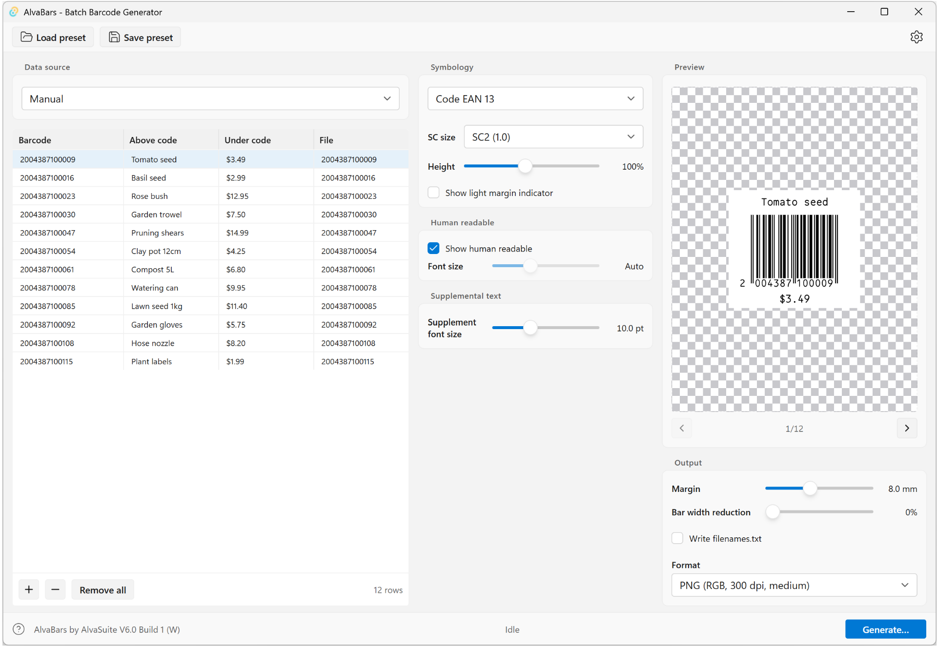
After: Fluent light tokens, Segoe UI Variable, 4px control corners, system accent blue, and an in-app toolbar that fits the Windows chrome. There also subtle hover and highlighting effects that the screenshot doesn’t capture.
Summary
Problem. AlvaBars is a batch barcode generator built with Tauri 2, SvelteKit, Tailwind CSS v4, and shadcn-svelte. Feature work was finished on macOS, so the first Windows builds still looked like a standard cross-platform app: custom teal accents, IBM Plex Sans, and radii that do not match WinUI controls. After some Googling it became clear that using Tailwind’s “variants” was the way to go and we instructed Cursor to use this approach to match the Windows 11 style. While the basic workflow was sound and Cursor did produce reasonable results out of the box, there was lots of hand-holding involved to get the styling just right.
Note that all changes are made on the JS / CSS side of things. The Rust backend is not involved.
Solution. Detect the host OS at launch, decorate <html> with .win or .mac, and apply a selective Fluent light theme on Windows only:
- Platform store via
@tauri-apps/plugin-os, with a user-agent fallback for browser preview. - Tailwind
win:/mac:variants (v4@custom-variant) gated on those root classes. - CSS custom properties remapped under
.winto WinUI / Fluent light tokens (accent#0078D4, Mica-adjacent chrome#F3F3F3, 4px / 8px radii). - Control polish with
win:overrides on buttons, selects, and sliders - default keeps the original classes. - Typography: Segoe UI Variable on Windows; IBM Plex only loaded as default.
- Native Windows 11 Mica on the title bar comes from the OS when using a standard decorated Tauri window - no custom title-bar code required for the basic effect (note gradient in the title bar in the screenshot)

System chrome: Windows 11 applies Mica to the AlvaBars title bar automatically.
We deliberately did not mirror every utility into win:/mac: pairs. An early experiment that prefixed all classes broke styling (variants never matched). The durable approach is: shared unprefixed layout classes, plus targeted win: overrides and .win { --token: … } for the palette.
Likewise we did not attempt to simulate the Mica effect in the actual app window. To retain readability of the data grid, we left the background at defaults (compare this approach to the Windows File Explorer who also does this). For an app that actually uses this effect in the main window see the Windows Store app.
Files we modified
Paths are relative to the AlvaBars app root (apps/alvabars).
Added
| Path | Role |
|---|---|
src/lib/platform.ts | Detect OS, publish Svelte store, apply .win / .mac on <html> |
src-tauri + npm | @tauri-apps/plugin-os / tauri-plugin-os, capability os:default |
Theme & layout
| Path | Role |
|---|---|
src/app.css | @custom-variant win / mac; Fluent token block under .win; Segoe stack |
src/routes/+layout.svelte | platform.init(); load IBM Plex only when $platform === "mac" |
Controls (selective win: overrides)
| Path | Role |
|---|---|
src/lib/components/ui/button/button.svelte | Accent / subtle hover; 4px radii on compact sizes |
src/lib/components/ui/slider/slider.svelte | Thin track (~4px), larger thumb (~20px) |
src/lib/components/ui/select/select-trigger.svelte | ComboBox-style hover / focus |
src/lib/components/ui/select/select-content.svelte | Flyout chrome; portal / viewport fixes |
src/lib/components/ui/select/select-item.svelte | Subtle item highlight |
src/lib/components/Panel.svelte | Slightly tighter Win radius on panels |
src/lib/components/PreferencesDialog.svelte | Overlay radius (win:rounded-xl) |
src/lib/components/CsvImportDialog.svelte | Same overlay treatment |
src/routes/+page.svelte | Toolbar chrome, win: radii on panels/controls, status branding |
Related product work landed in the same release branch (in-app toolbar instead of a classic Win32 menu bar, clipboard import, i18n), but the diffs below focus on the Fluent / platform styling core.
Structural changes (git-style diffs)
1. Platform detection and root class
New module: detect macOS vs Windows, then set the root class so CSS and Tailwind variants activate.
--- /dev/null
+++ b/src/lib/platform.ts
@@ -0,0 +1,45 @@
+import { writable, type Readable } from "svelte/store";
+import { platform as tauriPlatform } from "@tauri-apps/plugin-os";
+
+/** Host OS used for UI / chrome decisions. Linux is not supported. */
+export type AppPlatform = "mac" | "windows";
+
+export function detectPlatform(): AppPlatform {
+	try {
+		return tauriPlatform() === "macos" ? "mac" : "windows";
+	} catch {
+		const signals = [navigator.platform, navigator.userAgent].join(" ").toLowerCase();
+		return signals.includes("mac") ? "mac" : "windows";
+	}
+}
+
+function applyPlatformClass(value: AppPlatform): void {
+	const root = document.documentElement;
+	root.classList.remove("win", "mac");
+	root.classList.add(value === "windows" ? "win" : "mac");
+}
+
+function createPlatformStore(): Readable<AppPlatform> & { init: () => void } {
+	const { subscribe, set } = writable<AppPlatform>("windows");
+	let initialized = false;
+
+	return {
+		subscribe,
+		init() {
+			if (initialized) return;
+			initialized = true;
+			const value = detectPlatform();
+			applyPlatformClass(value);
+			set(value);
+		},
+	};
+}
+
+export const platform = createPlatformStore();
Wire it once at app start; keep default webfont off Windows.
--- a/src/routes/+layout.svelte
+++ b/src/routes/+layout.svelte
@@ -1,8 +1,11 @@
 <script lang="ts">
 	import "../app.css";
+	import { platform } from "$lib/platform";

 	let { children } = $props();

+	platform.init();
+
 	function onContextMenu(event: MouseEvent) {
 		event.preventDefault();
 	}
@@ -12,12 +15,14 @@

 <svelte:head>
 	<title>AlvaBars - Batch Barcode Generator</title>
-	<link rel="preconnect" href="https://fonts.googleapis.com" />
-	<link rel="preconnect" href="https://fonts.gstatic.com" crossorigin="anonymous" />
-	<link
-		href="https://fonts.googleapis.com/css2?family=IBM+Plex+Sans:wght@400;500;600&display=swap"
-		rel="stylesheet"
-	/>
+	{#if $platform === "mac"}
+		<link rel="preconnect" href="https://fonts.googleapis.com" />
+		<link rel="preconnect" href="https://fonts.gstatic.com" crossorigin="anonymous" />
+		<link
+			href="https://fonts.googleapis.com/css2?family=IBM+Plex+Sans:wght@400;500;600&display=swap"
+			rel="stylesheet"
+		/>
+	{/if}
 </svelte:head>
2. Tailwind variants + Fluent tokens
Tailwind v4 uses @custom-variant instead of JS addVariant. Tokens live on .win so default :root values stay untouched.
--- a/src/app.css
+++ b/src/app.css
@@ -2,6 +2,8 @@
 @import "tw-animate-css";

 @custom-variant dark (&:is(.dark *));
+@custom-variant win (&:where(.win, .win *));
+@custom-variant mac (&:where(.mac, .mac *));

 :root {
   --radius: 0.5rem;
   /* … existing default / shared tokens … */
 }

+/*
+ * Windows 11 Fluent light theme (WinUI / WPF Fluent tokens).
+ * Applied when <html class="win"> — see $lib/platform.
+ */
+.win {
+  --radius: 0.25rem; /* ControlCornerRadius 4px → rounded-lg; OverlayCornerRadius 8px → rounded-xl */
+  --app-chrome: #f3f3f3; /* SolidBackgroundFillColorBase (Mica fallback) */
+  --app-panel: #f9f9f9; /* SolidBackgroundFillColorTertiary */
+  --app-control: #ffffff;
+  --app-slider-track: #c8c8c8;
+  --app-slider-range: #0078d4;
+  --background: #f3f3f3;
+  --foreground: rgb(0 0 0 / 89.41%); /* TextFillColorPrimary */
+  --primary: #0078d4;
+  --primary-foreground: #ffffff;
+  --primary-hover: rgb(0 120 212 / 90%); /* AccentFillColorSecondary */
+  --control-hover: rgb(0 0 0 / 3.53%); /* SubtleFillColorSecondary */
+  --muted: #eeeeee;
+  --muted-foreground: rgb(0 0 0 / 61.96%);
+  --accent: rgb(0 120 212 / 10%);
+  --destructive: #c42b1c; /* SystemFillColorCritical */
+  --border: rgb(0 0 0 / 5.88%); /* ControlStrokeColorDefault */
+  --input: rgb(0 0 0 / 16.08%);
+  --ring: #0078d4;
+}
+
+.win,
+.win body {
+  font-family: "Segoe UI Variable Text", "Segoe UI Variable", "Segoe UI", sans-serif;
+}
Expose the extra hover tokens to Tailwind’s theme bridge:
--- a/src/app.css
+++ b/src/app.css
@@
   --color-primary: var(--primary);
   --color-primary-foreground: var(--primary-foreground);
+  --color-primary-hover: var(--primary-hover, var(--primary));
+  --color-control-hover: var(--control-hover, transparent);
3. Buttons: accent hover and WinUI corner radius
With --radius: 0.25rem on .win, rounded-lg lands at 4px (controls) and rounded-xl at 8px (overlays) — matching Fluent’s control vs overlay radii.
--- a/src/lib/components/ui/button/button.svelte
+++ b/src/lib/components/ui/button/button.svelte
@@
 			variant: {
-				default: "bg-primary text-primary-foreground [a]:hover:bg-primary/80",
-				outline: "border-border bg-background hover:bg-muted hover:text-foreground …",
-				secondary: "bg-secondary text-secondary-foreground hover:bg-secondary/80 …",
-				ghost: "hover:bg-muted hover:text-foreground …",
-				destructive: "bg-destructive/10 text-destructive hover:bg-destructive/20 …",
+				default:
+					"bg-primary text-primary-foreground [a]:hover:bg-primary/80 win:hover:bg-primary-hover win:[a]:hover:bg-primary-hover",
+				outline:
+					"border-border bg-background hover:bg-muted hover:text-foreground win:hover:bg-control-hover …",
+				secondary:
+					"bg-secondary text-secondary-foreground hover:bg-secondary/80 win:hover:bg-control-hover …",
+				ghost:
+					"hover:bg-muted hover:text-foreground win:hover:bg-control-hover …",
+				destructive:
+					"bg-destructive/10 text-destructive hover:bg-destructive/20 win:hover:bg-destructive/15 …",
 				link: "text-primary underline-offset-4 hover:underline",
 			},
 			size: {
-				xs: "… rounded-[min(var(--radius-md),10px)] …",
-				sm: "… rounded-[min(var(--radius-md),12px)] …",
-				"icon-xs": "… rounded-[min(var(--radius-md),10px)] …",
-				"icon-sm": "… rounded-[min(var(--radius-md),12px)] …",
+				xs: "… rounded-[min(var(--radius-md),10px)] win:rounded-lg …",
+				sm: "… rounded-[min(var(--radius-md),12px)] win:rounded-lg …",
+				"icon-xs": "… rounded-[min(var(--radius-md),10px)] win:rounded-lg …",
+				"icon-sm": "… rounded-[min(var(--radius-md),12px)] win:rounded-lg …",
 			},
4. Sliders: WinUI proportions
Win11 sliders use a thin track and a larger thumb. Default keeps the web-style thicker track / smaller thumb.
--- a/src/lib/components/ui/slider/slider.svelte
+++ b/src/lib/components/ui/slider/slider.svelte
@@
 			class={cn(
 				"relative grow overflow-hidden rounded-full",
-				orientation === "vertical" ? "h-full w-3" : "h-3 w-full"
+				orientation === "vertical" ? "h-full w-3 win:w-1" : "h-3 w-full win:h-1"
 			)}
@@
-			class="relative block size-4 shrink-0 rounded-full border …"
+			class={cn(
+				"relative block size-4 shrink-0 rounded-full border …",
+				"win:size-5 win:border-black/10 win:shadow-md win:ring-0 win:hover:ring-0 win:focus-visible:ring-2 win:focus-visible:ring-primary/40 win:active:scale-95"
+			)}
5. ComboBox-style selects
--- a/src/lib/components/ui/select/select-trigger.svelte
+++ b/src/lib/components/ui/select/select-trigger.svelte
@@
 	class={cn(
 		"… rounded-lg border border-input bg-app-control …",
 		"data-[size=sm]:rounded-[min(var(--radius-md),10px)] win:data-[size=sm]:rounded-lg",
+		/* Win11 ComboBox trigger */
+		"win:hover:bg-control-hover win:focus-visible:ring-2 win:focus-visible:ring-primary/50",
 		className
 	)}
Design notes
Token source. Values track Fluent / WinUI light theme names (SolidBackgroundFillColor*, TextFillColor*, ControlStrokeColor*, system accent #0078D4). Where the webview cannot host true Acrylic/Mica inside the page, #F3F3F3 is the solid fallback that still reads as Windows chrome next to a real Mica title bar.
Radius math. Setting --radius: 0.25rem under .win reuses the existing rounded-lg / rounded-xl utility ladder instead of inventing a parallel radius scale. Default keeps --radius: 0.5rem.
What we avoided. Prefixing every class with win: and mac: looked attractive for “perfect” divergence, but it made the UI depend on the root class being present before paint and was easy to get wrong. Selective overrides + CSS variables were enough for a convincing Win11 pass.
Chrome beyond CSS. On Windows we also moved preset / settings actions into an in-app toolbar and dropped the native Win32 menu bar for a cleaner modern shell. The OS still owns the caption buttons and Mica title bar.
Takeaway
For a dual-platform Tauri UI, detect once, theme with tokens, override sparingly. Tailwind v4’s @custom-variant plus a small platform module gives you WinUI-colored controls on Windows and the original web-like personality on macOS — from a single Svelte codebase.
Stack: Tauri 2 · SvelteKit · Tailwind CSS v4 · shadcn-svelte · AlvaBars V6